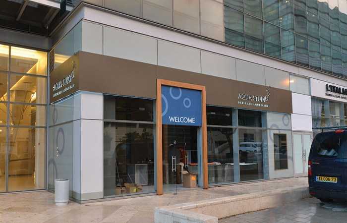
The right design at the checkout area can significantly increase revenues: 10 dos and don’ts for business owners.
A store’s checkout area has vast business potential, which is usually under-utilized. Frequently, this area is not addressed in a focused manner, because business owners assume that all customers must visit it to pay. This assumption is misguided. Forward thinking and proper analysis can leverage the checkout area and make the shopping experience enjoyable, even for customers waiting in line. Design and planning of an appropriate and “exciting” experience that matches the store will significantly increase sales in the checkout area.
Here are ten practical ideas to transform the checkout area into a kind of “store within a store”:
1. When the seller is comfortable, the customer is comfortable
The maximal level of attention should be given to the ease of working and operation. The checkout area is a workspace just like any other and it must be planned ergonomically and with a goal of maximum efficiency for both the employee and the customer. Easy access to products, the distance for placing things by the cash register, the operational area, etc., should be in the correct location and the right size. It is also important to ensure that high quality production materials are used that will withstand the checkout area’s high level of use: many checkout areas look great but cannot withstand the high level of traffic and will wear out faster.
2. The checkout area’s look matters
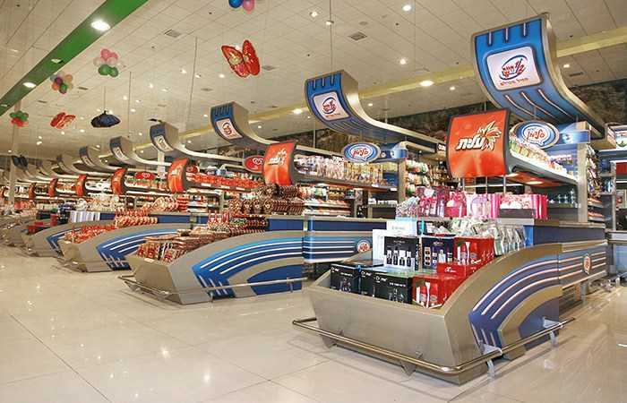
Suppliers have learned the potential offered by points of sale and provide stores with their own solutions and fixtures, e.g., refrigerators, stands, counters and signage systems. It’s nice to have someone else pay for these fixtures but often they are not the best option for your store or checkout area. In many cases, they are inefficient given the number of products and the floor space available.
3. Great design sells
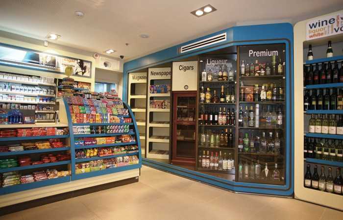
The cashier’s ability to sell is generally not considered when he is hired, and he is not always properly trained by the business owner. It is, therefore, imperative that the checkout area fills in this gap and its design must “sell” without taking into account the cashier. In many cases, the checkout area is also used for customer service and, therefore, product display is seen as a way of improving service, not an attempt to “sell” more products. The Yashir Group, an electrical equipment and tools chain, planned and implemented its checkout area to sell products that had not sold due to poor presentation. Fun in the Sun, a chain of convenience stores in Eilat, increased its sales at the checkout by tens of percent, and for some products by even higher amounts.
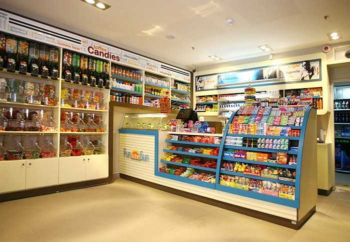 "Fun in the Sun" - Eilat convenience storesAn extensive and enticing mix of products displayed with precise and functional design.
4. Correct design prevents shoplifting
Business owners often avoid stocking a variety of products by the checkout due to theft. Careful planning of the checkout area and avoiding the concealed areas (such as tiered displays and exposed upper surfaces) can minimize theft.
5. Enter, buy, and leave
Many business owners place the checkout area near the store’s entrance to control the entry and exit of customers. This layout may cause the customer to go directly to the checkout area for service instead of being exposed to the displays and categories of products throughout the store. To overcome this problem, the checkout area should feature products available in other parts of the store.
6. Deja vu
The customer experiences the checkout area several times and at different angles. The first time, it is a glance from a distance of a few meters. The better the space is organized, the clearer it will be to the customer what to expect and how to prepare to enter this space. When the customer arrives at the cashier or waits in line, he is exposed to products being offered, experiences the checkout line and communicates with the cashier. Maintaining continuity and connection between all these elements (including signage, shelving and displays) is necessary to create a unified and well-defined area. The access to the checkout counter is sometimes only possible from one direction, depending on the store’s routes. The checkout counter must look inviting from that angle and not necessarily from every angle in the store.
7. Be refreshed at the end
In approaching the checkout area the customer should feel as though he is entering a new and refreshing area following the shopping experience. The message should be one of welcoming the customer, a chance for deals and a promise of excellent service to pique the customer’s interest.
8. I’m bored – I’m leaving
A bored customer who is standing in line will feel that time is passing very slowly. Exposure to products and even properly placed passive media will help. The line is the only place where the customer actually is standing still, so digital media to transmit messages is optimal for those standing in line and not those actually being serviced by the cashier, which requires different digital content.
9 . At eye level
Planning the space for the cashier means taking into account space constraints and relationship to the customer. The cashier does not need more than 80cm (31 inches) of space, and can be provided with a stool together with a raised platform. It is crucial that the cashier not be significantly lower than the customer and that the standing area not be too big and create a distance from the customer, which will also distance any displays behind the cashier.
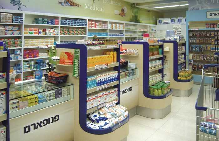
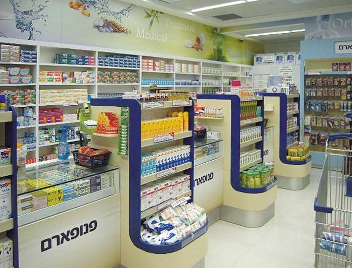 "Panopharm" pharmacy chainA unified look that is attractive, displays merchandise and still provides privacy to the customer. The wall behind the cashier has been designed for display purposes.
10. Use your walls to sell, sell, sell
A wall by the checkout line provides the cashier with a background. This background can focus the customer on the cashier and/or on certain products, but it can also be distracting or confusing. The wall’s design is crucial. Kiosks frequently ignore this important space and use it to store cigarettes or other products that might be stolen, or to hang TV screens that do not sell anything. It would be better to create an inspirational display that communicates and supports shopping.
You’re about to open a store? Consider the option of a retail stand in a shopping mall. These have lower rents and many commercial advantages, but you should also be aware of their disadvantages.
The importance of marketing ideas in the design and planning of points of sale and how definitively these can impact a store’s performance and success.
The following is a survey of the potential and drawbacks of kiosks in Israel, and their opportunities to leverage correct planning and design.
Planning the customer’s path through your store can significantly increase sales and is important at all points of purchase.


