IKEA | Swedish food shop
Ikea, the largest chain store for furnishings and houseware in the world, handles the design and planning of the stores with an ‘in house’ team, which operates according to a uniform marketing concept and design line for all its stores around the world. Under this guideline, the architecture and layout (the customer’s walking route) is determined, as well as the planogram which defines the manner of display and positioning of the products, designing the display and shelving systems, and even the graphic language and the representation of the brand’s values. At the end of the shopping trip, immediately after the check-out lines, there is a “Swedish market” in which imported high quality Swedish products are offered at an attractive price, and are not sold anywhere else in the country.
To the disappointment of the chain owners, despite the fact that those waiting in the checkout lines are exposed to the store while waiting in line, only a small fraction of them continue on to the Swedish shop (a percentage of one digit), the challenge is to create an optimal exposure of these products and to improve the revenues of the compound.
Ikea approached us to design and execute the compound in the new store at the Jerusalem branch, in anticipation for a different solution than the existing one. Our freedom of action was extensive and included the option to re-examine the aspects of the compound’s planning and design aspects, including the intervention in the graphic language.
At first we toured several of the existing stores and we studied the outline, while analyzing the efficiency of the overall sales system in the store. We identified several components which required reference and change, however, the most prominent of them all was the fact that the food court received an identical treatment as all the other categories of furnishings and products in the store. Meaning, the customers who reached it at the end of a long walk along the furniture and accessories routes, did not show any interest in it because it looked like just “another category”. In order to interest the customer in what the store has to offer, it is required to entice him in, using a unique design and a differentiated shopping experience. Additional difficulties we identified were that the products themselves are relatively small and do not attract from a distance, the display system is not divided into distinct categories in a manner which creates their exposure, and the fact that the area lacks an inviting entrance at the level of the route or signage.
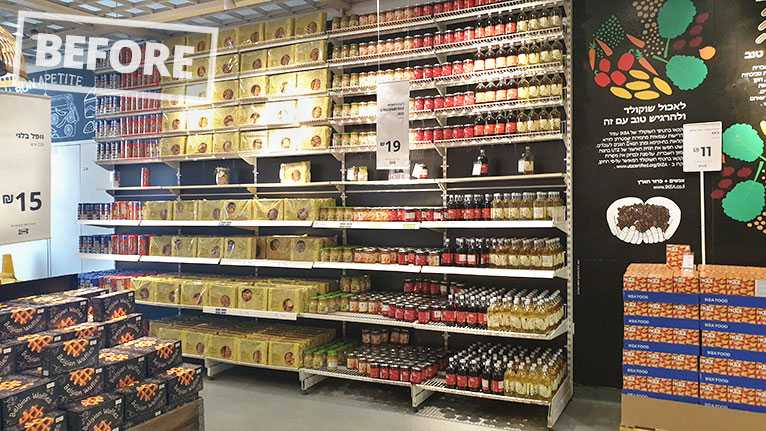
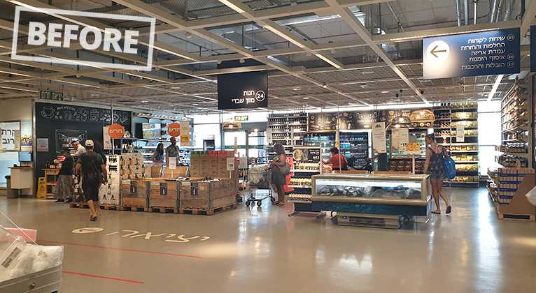 A standard Swedish food market in another IKEA branchVisibility from the checkout lines
We collected data regarding the conditions and constraints of the area – size and location of the area allocated for the shop, defining the optimal number of employees and the number of items (SKU’s). We then proceeded to a process of individually re-designing and planning all the display areas and the visibility of the store.
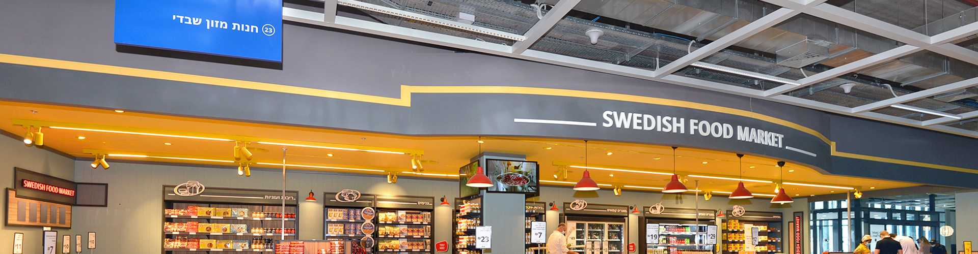
Creating an initial interest
In terms of customer exposure, the location of the store in front of the checkout line is regarded as a great potential that hasn’t been realized so far. The situation is that the buyer is waiting for his turn several minutes without doing anything, when right in front of his eyes there is the Swedish shop. This wait can be used to create the necessary stimulus, however, the current compound does not create interest. The assumption that the compound was unsuccessful because perhaps the customer is already tired by the time he finished his shopping, is invalid to our understanding – it is possible to compare it to a duty-free shop in terms of the buyer’s condition. Even after a vacation and shopping abroad, and waiting at the passport control, it is possible to create a renewed interest in the duty free complex and invite the customer to be exposed to the range of products that are sometimes unique to that store. It was decided to invest in a prominent and attractive visibility of the compound façade, and in the planning of the customer’s route in the store in a way which will guarantee a simple, non-exhausting shopping experience.
 Visibility of the Swedish food market from the checkout linePotential for creating interest among the customers waiting in line
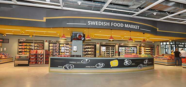 The renewed face of the compoundCommunicating from a distance and creating interest
The walking route in the store
We saw the need to address the customer’s walking route in the store, unlike the existing situation in which the customer can enter from several points and roam around the compound randomly, without a preferred route being suggested to him. This situation is not ideal due to the fact that we are missing the opportunity to create interest in the route, and to offer an optimal route starting with the first product he encounters, with a promotion every few meters, the order of the various categories etc. – A design which will maximize the exposure to the different products.
 The display of products on the shelvesAllocating a large area in the line of sight for a single product
 Improving the display of products on the shelvesIncreasing the range and reducing the number of items from each product
Product display
Arranging the shelf in the existing food store is done in the same way as the arrangement in the accessories area in the large store. Ikea projects strength by displaying large inventories, even at the line of sight which is considered the most attractive locations in terms of display, one single product is displayed on a large shelf surface area. In the field of food, and especially in this unique Swedish food store, this type of display is less suitable. We suggested a different approach for the display of products, so that in the line of sight the main variety will be displayed and not a single product. When such a large quantity of the same product is displayed, it loses its uniqueness, a uniqueness that Ikea tries so hard to emphasize in this store. In the new arrangement it will still be possible to find stacks of promotion, but not masses of products in every opportunity. In addition, some of the products are unfamiliar to the Israeli public, and therefore tasting stands were incorporated in the shelving system in order to enable the public to experience the products.
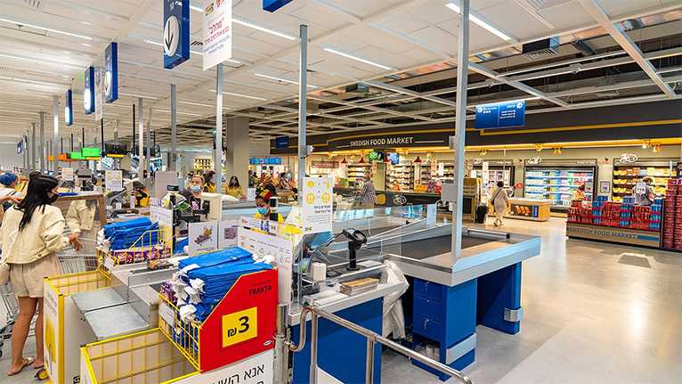
Designing the checkout line
This area is the last opportunity to communicate with the customer and to offer him a variety of products. The product display in the checkout line was not planned efficiently and the number of products was small. The new design offered an improvement in the range of products in this area as well as in the location and display space, which contributed to a significant increase in sales at the checkout line.
 Standard checkout line at another branch
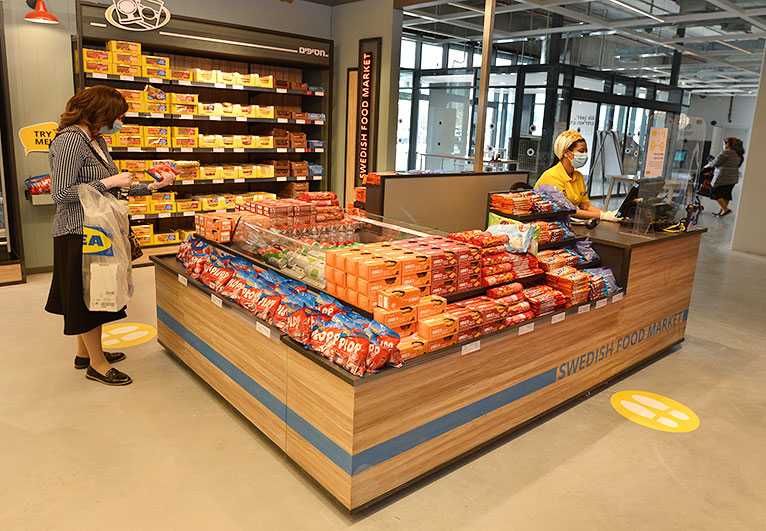 The renewed checkout areaA rich display of a variety of products


