You do not need words to sell furniture, clothing or food. Incorporating savvy design using scents or humor, or playing with different heights or movement in a space can sell more than you think. Starting now, you will look at store design differently.
What draws us to one particular store when a similar one is right next to it? As shoppers, what will make us linger in this store and buy more? Aesthetics are important but we forget other design opportunities, all of which have the same underlying principle: the store should provide shoppers with a maximal, albeit passive, experience where everything is within reach and they need only choose what to buy. Lior Koren of the firm Koren Visual Solutions explains that the experience today contrasts with shopping in the 1980s, when bottles of Coca Cola were not displayed on shelves but under the counter. To buy a bottle, the customer had to be proactive and request the product. Today it is crucial to present the product in the right packaging, in a manner that makes customers feel they have gotten good value and, of course, making sure they do not feel cheated. How can you achieve this? Here are a few design secrets:
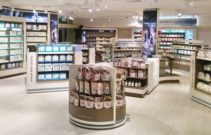
Room to explore on a matte floor (Koren project)
The Ahava store is aimed at tourists and sells products that customers can try before buying. The challenge to planning the store was to entice a large number of hurried tourists, make sure they understand the products and create the feeling that the products are a valuable purchase. To this end, the planners created aisles with space to walk around. The displays clearly identify whether the products are intended for men or women, whether they are luxury products, and which products are on sale. To prevent customers from having to bend down, the shelves were raised and the total number of products was cut to reduce confusion. Due to the store’s proximity to the beach, shoppers sometimes come in bathing suits and flip-flops. Matte flooring was used to prevent the impression of a dirty floor.
Roundness encourages movement
The concept store and visitor center of Bara Herbs, a company that produces natural, plant-based remedies, was planned with two dominant elements in the center to draw the eye – and, therefore, foot traffic. Treelike design elements based on the company’s content project the message of integration between nature and technology and convey the brand. The curved shape and location of the “trees” relative to each other and the rest of the store were planned to encourage customers to walk around them. A visitor typically glances into the store, see the two trees and without even noticing enters the store to investigate; in doing so, the customer is exposed to the products on display and the store itself.
Changing display
In Tomik, a wood furniture store, a display wall with different cabinets and dressers was created to simulate a corner of a home. The wall is intended to enhance the shopping experience and help customers see how items will look in their own homes. The wall serves as a changing display that draws the customer in and enhances the shopping experience. “When customers come to choose a piece of furniture, it’s hard for them to imagine how it will look at home,” explains the designer Maya Moseyov. “Accessorizing and styling with furniture, a light fixture, books and a pretty background imitates an aesthetically-pleasing part of a house and gives the customer an accurate idea of how the object will look at home. The design was not created to generate sales, but it definitely affects the customer’s decision and helps with her select the right piece.” Tomik’s owner, Tamar, confirms that any cabinet or chest placed on this wall sells faster. “People come in to the store and immediately look at the display wall. Furthermore, it [the wall] adds style to the store.”
Leggy humor (Koren project)
How can fashion be introduced to a supermarket without the clothing looking cheap? In the Hod HaSharon branch of Hazi Hinam, the clothing area was designed to be distinctive from the food departments to draw customers into the new fashion department. On the one hand, the area was not over-designed to create confidence in the products, while on the other hand the design was meticulously conceived with a humorous touch. To get customers to smile, illustrated figures with three-dimensional legs are hung on the wall. The idea behind the display was clear and deliberate: the fashion here cannot be compared with luxury fashion.
 Hazi Hinam - home textile and Clothing shop
Partition removed, products boosted (Koren project)
Products displayed in bulk are intended to broadcast a message of freshness and, therefore, of luxury. To promote this idea in the Tamar spices store, the glass partition from the nuts display counter was removed, which also created trust between the seller and the buyer (although Koren accounted for customers “tasting” while shopping). The white fluorescent lighting was replaced with lighting designed for food that mimics the warm light of an incandescent bulb that focuses the eye on a product. The halva, which was less popular with customers, was placed at eye level to emphasize the impressive blocks. The bags of spices were placed on low stands above the floor to prevent dirt and dust from accumulating around them and to broadcast a message of attractiveness and cleanliness.
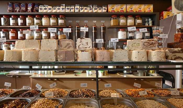 Tamar - spice shop
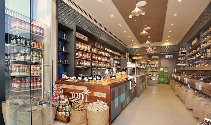 Tamar - spices shop
An inviting wall and comfortable changing rooms
For Kids Mode in Bnei Brak, a store without a display window, a concept wall was built at the entrance to hint at the products inside and draw customers. The wall is designed to make it easy to combine items, and changes according to the collections, seasons and holidays. The changing rooms were also carefully designed to make them comfortable for the customer to take the time to make decisions about what to buy. The more comfortable customers are, the more likely they will make larger purchases.
Flow with the triangle (Koren project)
A tiny and difficult location in the Azrieli Mall did not discourage anyone at Fresh. The triangular corner location was preserved by a design that extends beyond the space like an inverted funnel or trumpet. No attempt was made to square or adjust the space with conventional planning methods. The green wall expands towards the entrance, the counter breaks out of the space and broadcasts energy, and the customers stop to look at the restaurant because they sense it has tried to approach them. The food is prepared in the rear kitchen onsite, but to convey the freshness of the brand pots and plans are used in the décor.
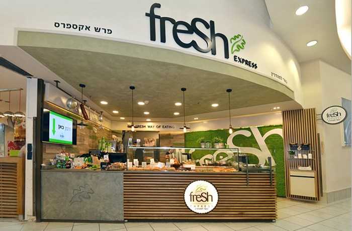 Fresh Kitchen - Fast food shop


